B2B pricing calculator redesign concept
A UX exercise on a public B2B pricing flow. Faster country selection, honest steps, a summary that stays visible, and a version you can finish on a phone.
- Context
- Redesign concept
- Role
- Self-initiated product exercise
- Date
- June 2026
The short version
- The problem
- A public pricing calculator leaned on a long country list, with the next step far from the decision.
- What I did
- Redesigned it as four steps with search, a live summary and a mobile pattern that works, as a design hypothesis built without inside data.
- What it was worth
- A concept that shows the reasoning, including when I would ship directly and when I would test first.
- The call
- For a low-risk public flow, I would ship it directly and monitor, rather than queue an A/B test.
Why I did this
I made this while researching a company I had applied to. The pricing calculator was one of the few product flows I could reach from outside, so I used it as an exercise.
I had no analytics, customer feedback, sales context or internal priorities. So this is not a claim that the existing flow was wrong, or that it mattered commercially. It is a design hypothesis built on friction anyone can see.
Observed friction
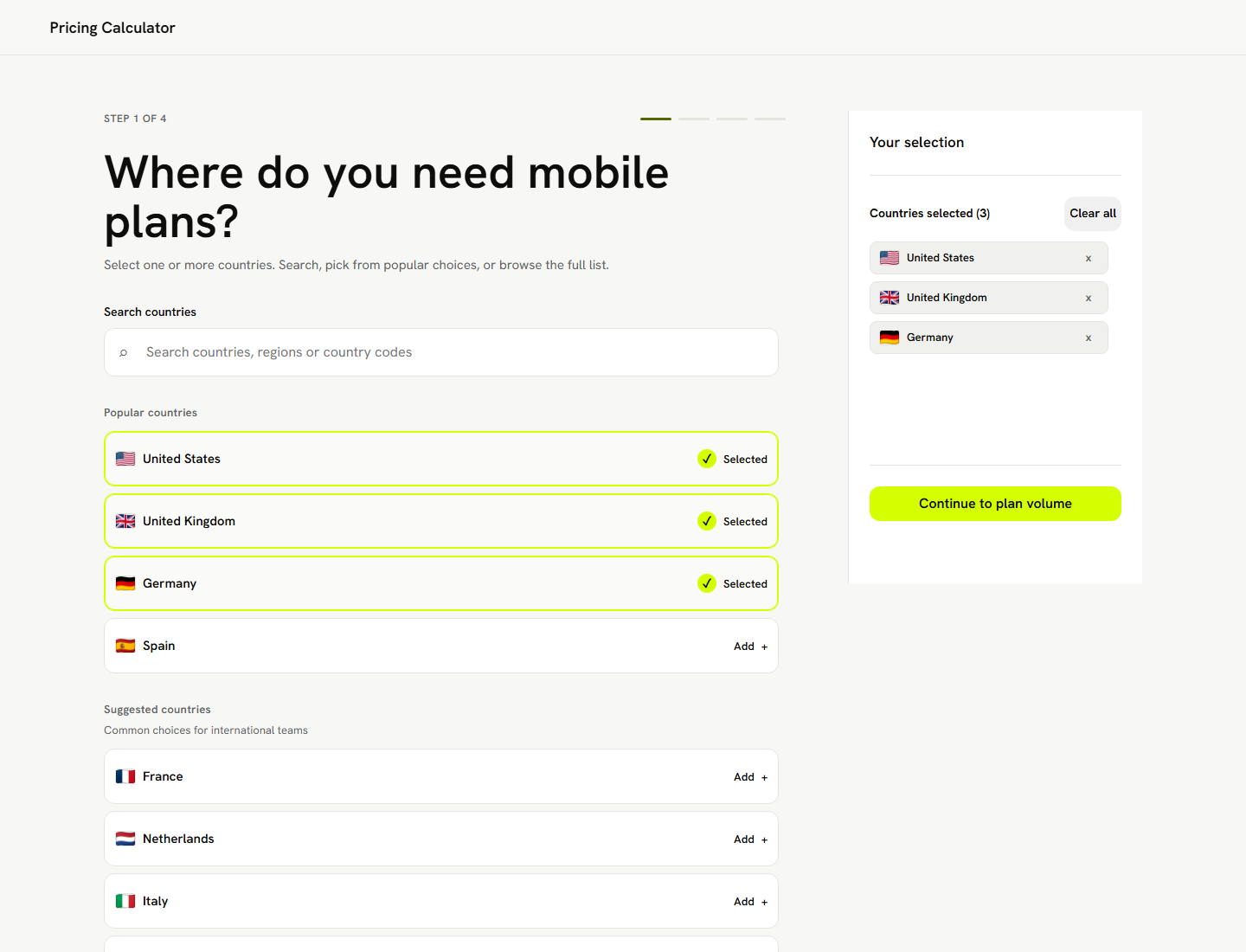
The original flow leaned on browsing a long country list, with the next action some distance from where the choice was made. Pick several countries and it got hard to see what you had selected and what to do next.
Six things I wanted to try.
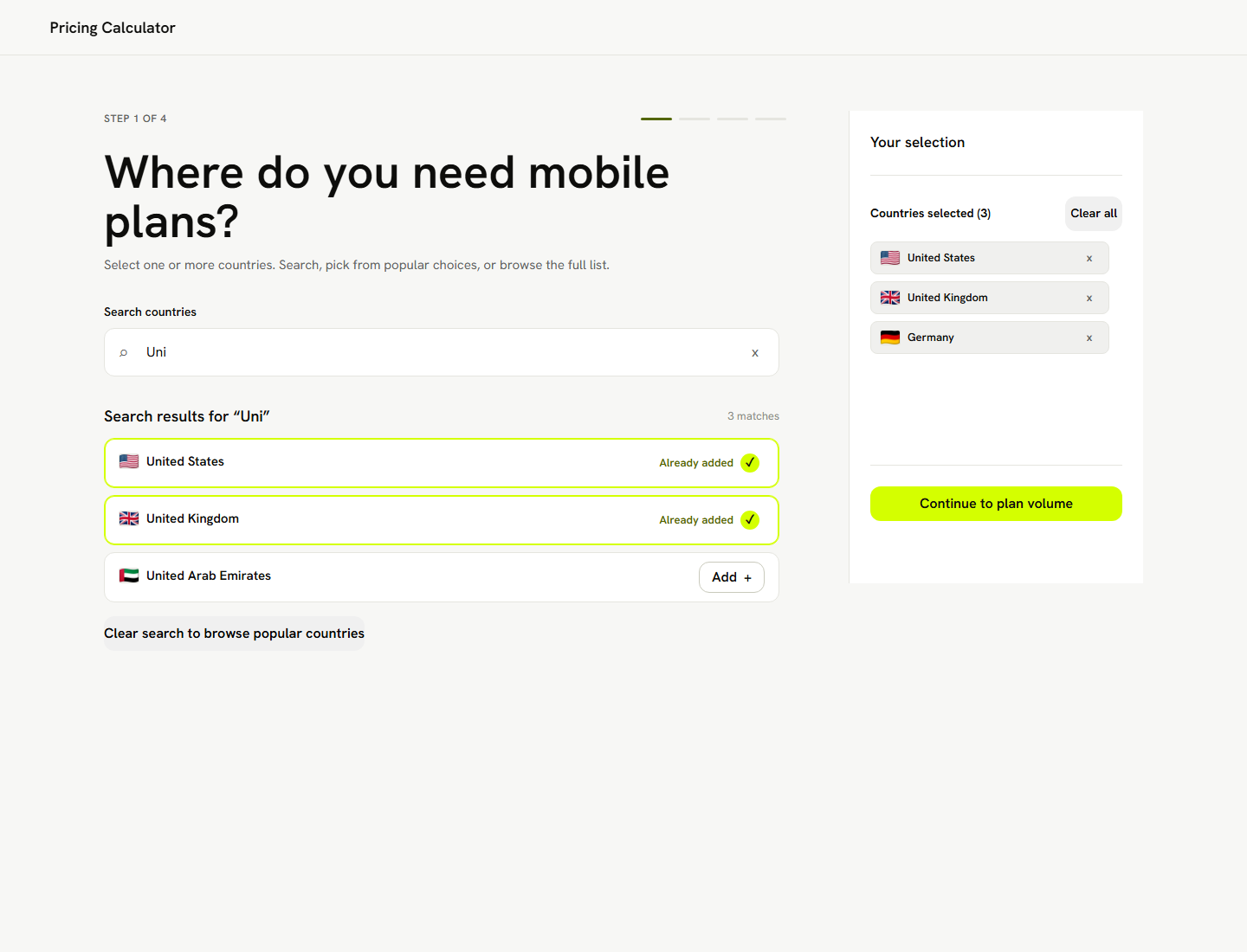
- Faster country selection through search and shortcuts
- A clearer summary of the selected countries
- A more obvious next action
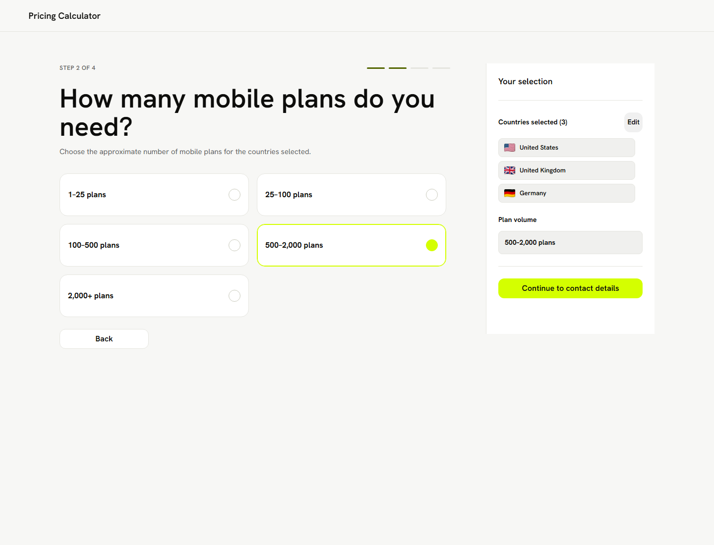
- Plan volume as its own step
- A contact step that felt connected to the calculator
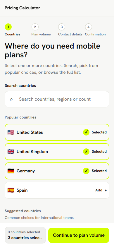
- A mobile pattern that did not depend on a desktop sidebar
Redesign direction
One principle. The main area is where you make the current decision, and the summary shows where you are and helps you continue.
The flow became four steps.
- Countries
- Plan volume
- Contact details
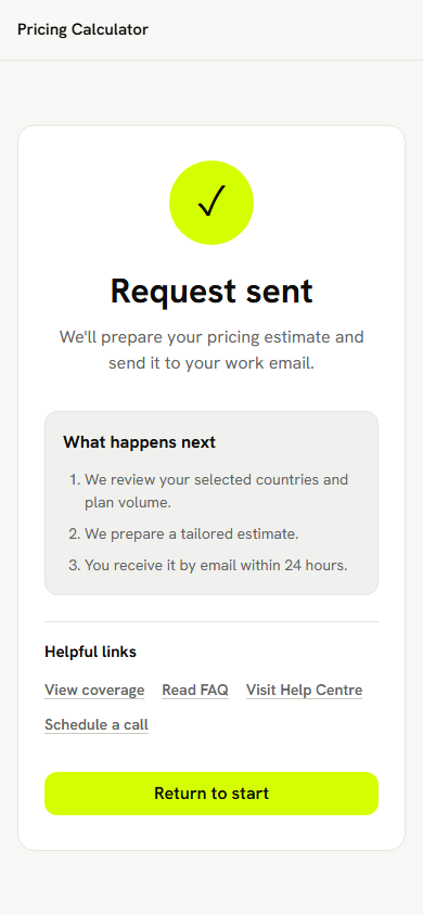
- Confirmation
On desktop the right sidebar is the live summary. On mobile a sticky bottom summary and a bottom sheet do the same job.
Screenshots
Product judgement
I would not put a redesign like this into an A/B test by default. A workflow that existing customers repeat every day would make me cautious. A public pricing and contact flow aimed at new visitors is lower risk, and a simpler design could reasonably ship directly, provided completion, lead quality and what sales hear are watched afterwards.
Inside the company I would check traffic, funnel data, how sales use it and the risk first, and then decide between shipping it, testing it and asking customers.